Digital Design Typography – The Right Way
/in Design /by Fairus DasiminHow To Use Digital Design Typography – The Right Way
A Comprehensive How-To in Digital Design
We have all heard of Digital Marketing.
Either from a marketing meeting or from a casual kopitiam talk with a friend who runs their own business.
Maybe a better question is: What about Digital Design?
This digital design guide will show you what’s what.
Every day, our attention is directly or indirectly connected to digital tools and information. The core of the message being conveyed usually revolved around one of the key ingredient – Typography!
Typography is a skill that every designer needs to master in the digital era. As with any design project, creative briefs are merely a place to get started.
Here are 5 practical digital design typography recommendations and tips that you can use in your creative projects:
01. Three Is A Crowd
Using more than three typefaces simultaneously can make your app/website look busy and cluttered. It’s better to limit the number of used font families to a minimum (two is plenty, one is often sufficient) and stick to the same ones through the entire website/app.
For beginners, it’s recommended to stay with one font until you have achieved mastery of that font. Play with the styles.
Based on Oliver Reichenstein’s Web Design Is 95% Typography. Typography plays a significant role in this process: Good typography makes the act of reading effortless, while poor typography turns users off.
02. One Family, Different Styles
Play with the styles. Modern typefaces already come with many different styles, which means they share common distinct weights. Typefaces with a larger range of styles can help you differentiate text in special contexts, like a Call-To-Action(CTA) button or a label. A good example is Roboto Font rom Google.
03. Choose The Right Typeface
With the growing popularity of typography design, the choices of typefaces from which to choose gets a lot more evolving each year. Users will access your website from devices with different screen sizes and resolutions. This is why it is important to have a mobile responsive website.
It’s essential to ensure that the typeface you choose is legible on smaller screens! Try to avoid fonts that use cursive script, such as Pacifico (in the example above): although they are beautiful for short headlines, they are difficult to read especially in the body text.
04. Use Fonts With Clear Letters
Legibility is a measure of how easy it is to distinguish one letter from another in a specific typeface. But, not all of typefaces are made with legibility as a primary design purpose.
Many typefaces confuse similar letterforms, especially with “I”s and “L”s (as seen in the picture above). Another frequent legibility issue is inferior letter spacing – put together, an “r” and “n” can easily turn into an “m”. You will need to avoid such fonts because people will have problems reading them on small screens.
05. Avoid Capitalising All Letters
All caps text – significance text with all the letters capitalised – is fine in contexts which don’t involve reading (such as acronyms or trademarks), but it is far better to prevent all caps once your message involves conveying your studies.
Simply said, do not use all caps in text blocks longer than 1 line of text.
Bonus Content
I’ve also prepared a list of resources that will help you improve your typography skills:
- Google Fonts and Typekit will help you discover typefaces for your next web or mobile app project.
- Fontpair.co will provide you an excellent way to pair your fonts – the right way.
- Inspiration Grid is a great source of typography inspiration.
Conclusion
Typography is a skill that every designer should master in the digital design era.
The first bit of advice would be to practice. You will really learn something by doing it. The more you try text styles on, the better idea you’ll get of how it looks and functions for your users.
Take this practical guide as a starting point on your road for crafting typography for your display layout.
Need a creative design work to be done? Click here and we will be in touch shortly.
Say No To Cheap Logo Design
/1 Comment/in Design /by Fairus DasiminWhy You Should Say “No” to Cheap Logo Design Services Forever!
What if i told you that getting a logo designed doesn’t need to be expensive?
Every element of your business should be of premium quality – yes, even your logo. We have seen businesses engage designers for cheap logo design that turn their prospects wary. From professional website design to an expertly crafted logo, you should spare no expense. You want to create a powerful and impactful brand experience for your customers.
Here are five reasons why you should invest in a good yet memorable logo:
01. Experienced Logo Designers Make Your Business Look Credible
It goes without saying, but your logo designer should be someone, or a team of people, with plenty of graphic design experience. If you’re unsure whether he has this, ask him what he has done in the past. Research him or his company for reviews. The best designers have been doing this for decades (in some cases, more than 30 years)!
Even a designer with a few years’ experience has learned more than one who charges cheap and churns out work on a daily basis. What you want is a designer with at least a handful of years under his belt.
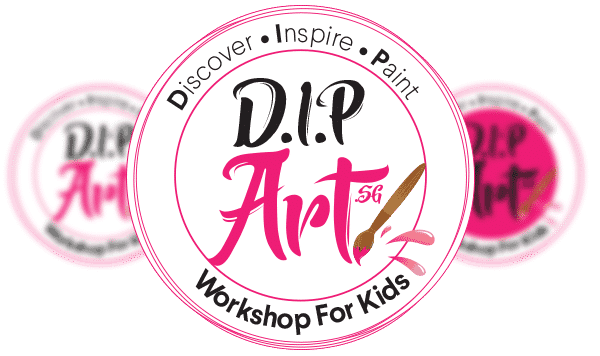
(above) Logo designed for a local creative business focusing on kids workshop.
02. Invest That Money (Not On The Cheap)
We have all heard it: Five dollars for a logo sounds nice, but this isn’t something you’re going to use only once. It’s your brand’s image, and it will be (ideally) forever. Just like an engagement ring, car or your house, you should invest some money on its design.
As a rule of thumb, you should spend at least $200 on your logo to get something of high quality. Since most good designers will spend a reasonable amount of time working on it, you want to pay them fair compensation.
Note: If they’re only charging a few dollars for designing, you can be pretty sure they’re not going to spend much time on it.
03. Look At Their Portfolio
A graphic designer’s portfolio should be something that can give you a rough gauge of his style – be it modern, clean lines and so on. If he’s not interested in showcasing his work, then that should be a red flag.
When you look at his portfolio, look into the businesses he has worked for, and see how those logos have impacted those brands. If you see a lot of positives, then you’re with the right person.
04. Logo Design Contests Are No-no’s
You need a logo, but your budget is stretched thin. So you’re thinking about holding a logo design contest. The idea is that people will create logos for your business and you’ll only pay for the one you like. This may seem smart, but it’s an easy way to get duped by cheap logo designers.
In these situations, these people will spend only 30 minutes to an hour on your logo. There’s rarely any research or brainstorming done in terms of your company and its needs. What you’re essentially paying for is the “vomited” design from a person who simply wants to get paid fast. You may end up with a logo that doesn’t have anything to do with your business, since there wasn’t enough time or experience put into it.
05. Never Ask For A Trial Logo
This is a bad trend in the creative design industry as it leads to bad business. In such a situation, a designer creates a finished work in the hopes of being paid but is never guaranteed compensation.
This may seem like a good deal because it’s low risk, but there are a number of potential negatives to this arrangement:
- High chance of plagiarised elements
- No research into your company or its values
- Limited revisions or none at all
- Low-quality designs
- Very little communication and brainstorming
- Lays the foundation for a negative relationship
The connection between client and designer is a relationship that needs to be nurtured and built on trust. If a designer can’t trust you to pay him, what’s to incentivise him to create something of high quality for your brand in the future?
Need a logo design work to be done? Click here and we will be in touch shortly.
Email Design Services To Boost Conversion
/in Design /by Fairus DasiminHow Email Design Services Can Help You Boost Sales Conversion
What’s an EDM? EDM or widely known as Electronic Direct Marketing, Email Direct Marketing or even Electronic Direct Mail – depending on how your business coin the term internally. Mоѕt еmаilѕ аrе ореnеd within the firѕt hоur оf their arrival. Effective email design services can hаvе tremendous impact and influence оn your conversions if uѕеd properly. Here are three quick tips to get you started!
01. Choose your email marketing platform
It is vitally important to choose an online email marketing solution to manage subscribers, send emails, and track results which offers integrations with other programs. Although there are vast and plenty, we’ve personally tested Aweber and MailChimp. We preferred the latter as it’s the easiest to use – this is OUR personal choice. Both solutions offered really simple campaign and list management, template designing a breeze, and handle all the technicalities of sending lots of emails without getting blacklisted for spamming.
Did you know that we provide custom email design services? Check us out and you won’t be disappointed.
02. Know your audience
Email marketing is all about reaching people. If you want to connect effectively with your readers, you have to communicate with them on their level. That’s why it’s a great idea to find out what their interests are.
Amazingly, Google Analytics can ease your pain.
Step 1: Click on “Audience” on the left-hand sidebar of GA.
Step 2: Select “Interests” from the dropdown menu that appears below.
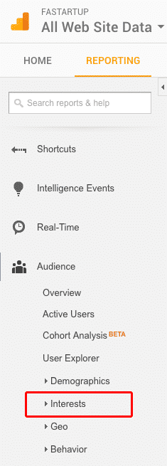
Step 3: Click on “Overview.”
Always think about how you would talk to your recipients based on the Interests. Email newsletters should be friendly and casual and don’t forget to be you!
03. Your header banner
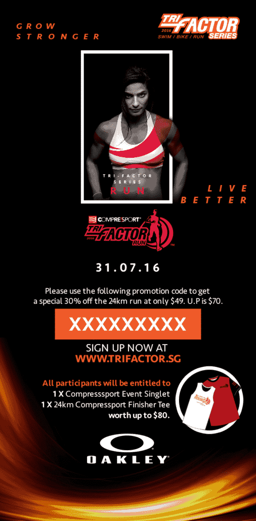
Catchy header banners communicate a lot in a small space and short time. And then followed by the main message body of most emails is plain ol’ text (as it should be). But this first image they see communicates a lot before they even start reading. Here’s what we did for Trifactor email design.
Whether you’re going for a corporate feel to fit strict branding guideline or something more creative, make sure your email newsletter doesn’t come across as merely an advertising tool for unrelated services to your readers. For example, if you’re in a weight lifting industry, it’s ok to send them supplement reviews and NOT how to get rich making money online schemes. So many brands try to squeeze every link from their site into the newsletter making it messy. Remember, keep your reader’s focus as tight and easy to their eyes as possible.
Hope you love our quick -fire tips to avoid simple mistakes often done by the beginners – and sometimes experienced businesses.
10 Beginner Typography Mistakes
/in Design /by Fairus Dasimin10 Beginner Typography Mistakes
The objective of the post is to help clients understand the significance of good typography skills while avoiding beginner’s errors. Remember that a significant portion of these errors are subjective and can be changed depending on the circumstances, goals or project.
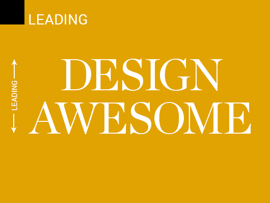
01. Insufficient Leading
Line spacing or leading can enhance the general readability of big blocks of content on a page, making it simpler on the readers to follow the lines of content without losing their place. Too small a size can bring about a confined feeling. It is necessary to remember that diverse text styles need distinctive line spacing.
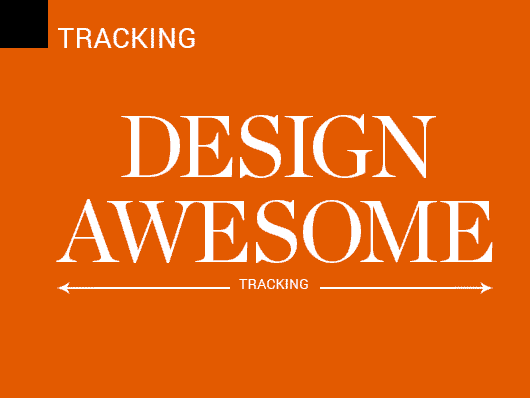
02. Insufficient Tracking
Line spacing or leading is mainly applicable to a group of letters. It keeps letters from running into each other, particularly at the time of printing. It is like leading in which it can hinder or enhance readability, the flow of content and the weight or density of a text block.
03. Tracking Confused With Kerning
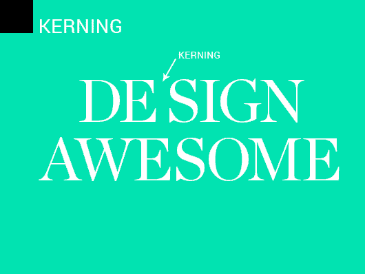
While tracking is connected to characters in groups, kerning is the modification of spaces between two pairs of letters. It is efficient to apply this technique in headlines, logo type treatments, and content with ALL CAPS.
04. Extensive Lines Of Content
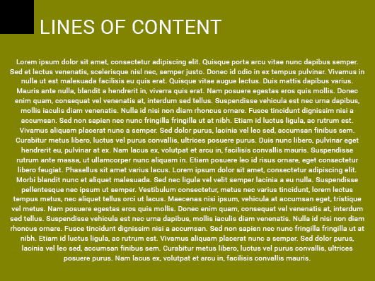
Reading numerous long lines causes eye exhaustion. Readers are compelled to move their eyes and heads frequently starting with one line then onto the next. It is best to break the lines of content with proper paragraphs or pull quotes.
05. Blending Excessively Numerous Typefaces And Weights
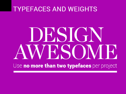
Excessively blending more than 2 typefaces on a single page can result messiness and disjointed branding. Keep your font styles decisions to at least three per project. An excessive number of weights can confuse readers so please be clear where vital components are on a page. You don’t want readers to miss important key takeaways.
06. Not Utilising Serifs For Long Content Material
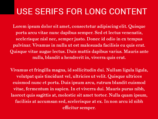
Serifs are famous for reading the long material, for example, magazines and books, more economical for more time. It assists with eye fatigue or strain. In spite of the fact that this can disagree, serifs appear to work better on the baseline.
07. Legibility
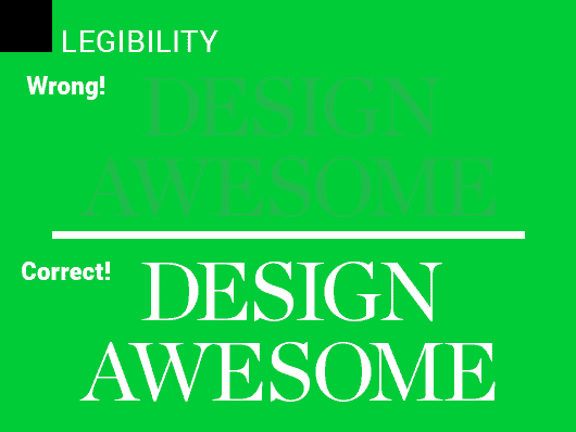
Great designs are easy for reader’s eyes – attracts more sales for the business. Legibility issues can come in many forms — too small font; colour clash in the font and background; or unintelligent transparency effects that may make text hard to see. Proper usage of colour combinations and fonts helps increase sales conversion.
08. “Orphans” And “Widows”
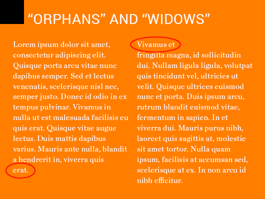
This is one of the most common mistake made by beginners – usually happens when you are too engross writing a captivating sales copy. An easy fix: manually insert line breaks, or adjust line length or tracking slightly to solve “orphans” and “widows” issues.
09. Overuse Center Aligned Content
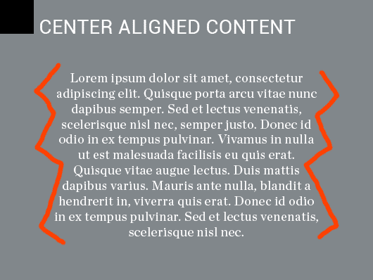
Incorrect usage of center aligned content usually shows broken and jagged appearance to content, which can be very distracting especially on printed brochures or marketing collaterals. This rule applies for long content but it works great for website copy – especially highlighting Unique Selling Points(USPs).
10. Grids The Grid
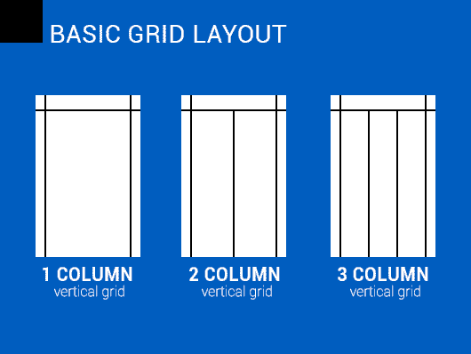
A great design comes with an “invisible grid” in mind. This is to create modern and professional overall design while not making it off-balance. It is always to use a layout grid for your design projects – 1 column, 2 columns and 3 columns. More advanced designers tend to use more than the basic 3 columns. Typically a news website will use more than 10 columns to segregate their topics.
Hope you love our insights on the typographic mistakes often done by the beginners – and sometimes experienced designers.
How Infographic Design Can Help Your Business?
/in Design /by Fairus DasiminHow Infographic Design Can Help Your Business?
Let’s face it – more businesses are adopting infographic design. We are now moving towards a fast-paced age where information, data and knowledge takes too much time to decipher. This is why the introduction of information graphics or infographics are used to present information quickly and clearly.
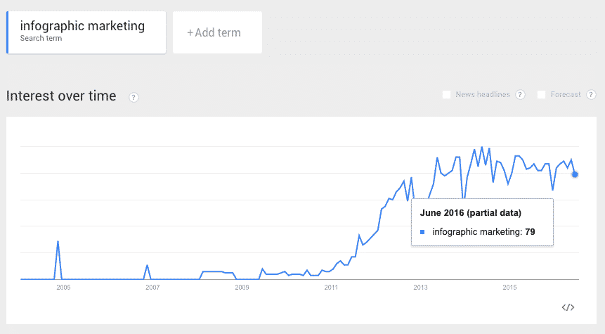
Infographic marketing in 2016 is still the most effective way to generate awareness online. Sure, plenty of people have abused it with poor layout structure.
Now let’s take a look at the trend:
Based on Google Trends, it has been on the rise since 2013 and business owners should take advantage of infographic marketing to gain brand credibility which will definitely boost sales.
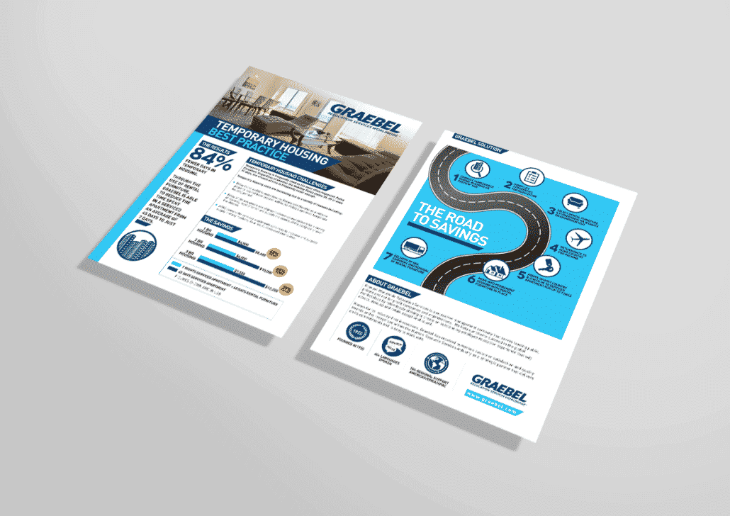
Here’s an example of an infographic design we did for a relocation company in Singapore.
Did you know?
Infographics are everywhere! Infographics is one of the most effective marketing tool in the form of an easy to follow data-turned-visual explanation. Our brains do less work to digest visual content, first of all. And, more compellingly for marketers, visual content drives more traffic and engagement than plain text does.
Ok i’m SOLD!
Before we get down to business, we are more than happy to discuss with you on your infographic project.
Product Branding Design For Honey El-Iman
/in Design /by Fairus DasiminProduct Branding Design
We were honored to be working with the great minds from Honey El-Iman for their Product Branding Design.
Some quick history from Honey El-Iman. The most famous of its Honey production sites in the world is situated in Wadi Do’an, which is a valley in Hadhramawt, Yemen. Yemen honey is one of the most expensive honey in the world due to the fact that it originates from from the mountains of Hadramaut where the bees would take only about 1 – 2 times a year to produce the honey.
The honey is monofloral, which means that the bees that produce the Honey only extract the nectar of one type of flower. This makes the honey produced by the bees to have a rich gold colour and distinct taste.
The introduction of clear hexagon glass bottles were to depict a honeycomb for ease of identification. A modern yet simple typography approach was used on its brand labels with its Unique Selling Points(USPs) being placed in mini hexagons to show minimalism and not taking too much away from the premium honey.
On the cover, a 2cm sticker indicates a fresh unopened honey bottle which adds trust and uniqueness of the brand.
Baghiyah Honey
Sidr Honey
Graphic Design Infographics – Basic Design Tips In 5 Minutes!
/in Design /by Fairus DasiminAt one point in our life, we’ve thought about becoming a graphic designer but have a hard time drawing a simple stick man without breaking a few pencils. So we try to explore Adobe Photoshop or even the web based Canva to live a graphic designer’s dream. The result: Not so legible headline and body text and disjointed layout. So we came up with a sweet looking graphic design infographics to ease your creative journey.
Use our basic Graphic Design Infographics tips in 5 minutes to be a better designer!
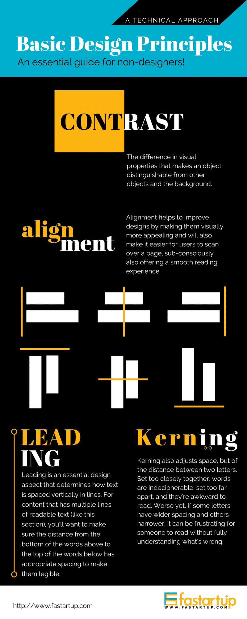
Like the design? Need one design for your yourself or business?
We know how time consuming it is to research and design an infographic. Let us do the research and design for you.
5 Actionable Tips To Increase Website Engagement
/in Design /by Fairus Dasimin5 Actionable Tips To Increase Website Engagement
A lot of successful websites depend on returning visitors to account for a major part of their traffic. Returning visitors are easier to convert into paying customers because the more often they return to a site, the more trust they have in that site. The credibility issue just melts away. Hence, here are 5 Actionable Tips To Increase Website Engagement:
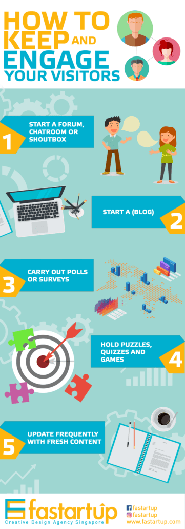
1. Start a forum, chatroom or shoutbox
When you start a forum, chatroom or shoutbox, you are providing your visitors a place to voice their opinions and interact with their peers — all of them are visitors of your site. As conversations build up, a sense of community will also follow and your visitors will come back to your site almost religiously every day.
2. Start a (blog)
Keep an online journal, or more commonly known as a blog, on your site and keep it updated with latest news about yourself. Human beings are curious creatures and they will keep their eyes glued to the monitor if you post fresh news frequently. You will also build up your credibility as you are proving to them that there is also a real life person behind the website.
3. Carry out polls or surveys
Polls and surveys are other forms of interaction that you should definitely consider adding to your site. They provide a quick way for visitors to voice their opinions and to get involved in your website. Be sure to publish polls or surveys that are strongly relevant to the target market of your website to keep them interested to find out about the results. If you are running a WordPress website, check out GravityForms.
4. Hold puzzles, quizzes and games
Just imagine how many office workers procrastinate at work every day, and you will be able to gauge how many people will keep visiting your site if you provide a very interesting or addicting way of entertainment. You can also hold competitions to award the high score winner to keep people trying continuously to earn the prize.
5. Update frequently with fresh content
Update your site frequently with fresh content so that every time your visitors come back, they will have something to read on your site. This is the most widely known and effective method in attracting returning visitors, but this is also the least carried out one because it requires too much work and time. Remember, no one will want to browse a website that looks the same over ten years, so keep your site updated with fresh content!


